
MULTI-SCREEN WORLD

What is a MULTI-SCREEN SITE?
A multi-screen site refers to one website that is optimized for desktop,
tablet and mobile. A common, but more technical, term for these kind of websites is “responsive.”

Devices are diversifying & WEBSITES MUST ADAPT
A desktop-only website used to cut it,
but not anymore…
90% use multiple screens sequentially to accomplish a task over time
The average person uses a combination of 3 different screens every day
Smartphones are the most common starting place for online activities
PCs/laptops are most often a starting point for more complex activities
Tablets are most often a starting point for shopping and trip planning
A MULTI-SCREEN SITE IS SEO GOLD
Google has declared that they prefer responsive web design over separate mobile and desktop websites.
THE REASON
One single URL makes it easier for Google
to search a site for relevant content.
HEREFORE
Responsive websites generally rank much
higher in search results.

IT’S ALSO MANDATORY FOR MOBILE
Google has recently changed the way they rank websites in mobile searches.Unless your website passes their Mobile-Friendly Test, it won’t even show up.
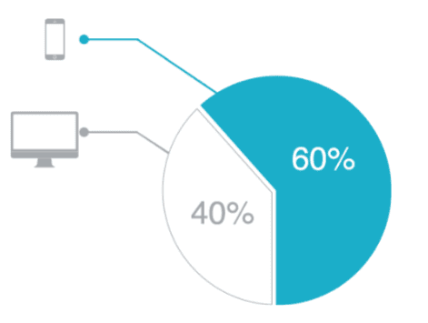
Up to 60% of all internet searches are now made on mobile devices.
WHICH WAY DO YOU WANT TO GO?

GO MULTI-SCREEN:
73% of visitors prefer a
site that’s optimized for
mobile
Faster load times
Takes full advantage of
the 4.4 hours of leisure
time customers spend in
front of different screens
each day
STAY THE COURSE
61% of visitors will abandon a
site that isn’t mobile-friendly
40% of consumers will
abandon a web page that
takes more than
3 seconds to load